Disclosure: topratedkitchenware.com is reader-supported. When you buy through links on our site, we may earn an affiliate commission from Amazon and other retailers, at no extra cost to you.
Where to buy
The six sinks below are the verified shortlist for this guide to best looking kitchen sinks. Looks are the brief, but they are judged the way a kitchen lives with them — in brushed finishes that age gracefully, clean undermount lines, and proportions that suit real counters — not by a single rendered photograph. Every pick links to its Amazon listing so you can check the latest price on Amazon, study the finish and dimensions closely, and picture it against your own counters before you decide.
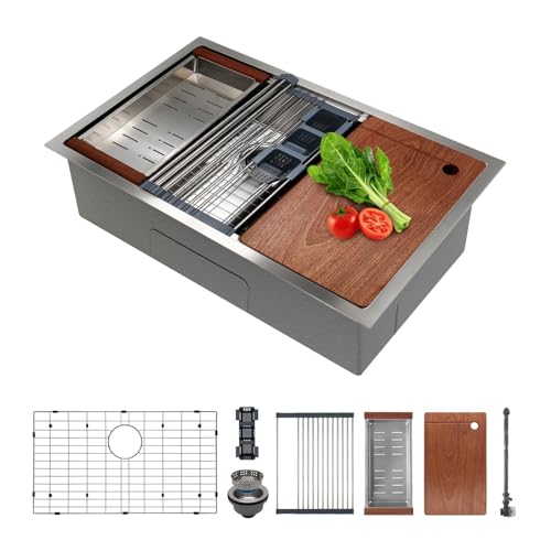
- KRAUS KWU110-32 Workstation Undermount Sink
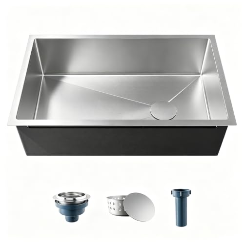
- KRAUS KHU100-32 Undermount Kitchen Sink
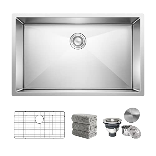
- Oxwiser 30×18 Inch Undermount Sink Bundle
- Delironexu 30 Inch Undermount Kitchen Sink
- Oxwiser 32×18 Inch Undermount Sink Bundle
- KRAUS KHU640-33 Undermount Kitchen Sink
Read the full guide ↓ for the design details that separate a sink that photographs well from one that still looks right after a year of breakfasts.
Ranking the best looking kitchen sinks requires admitting something most buying guides avoid: a sink’s looks are mostly decided by restraint. The bowl sits inside a composition — counter material, cabinet colour, faucet finish, lighting — and the sinks that elevate that composition are rarely the loudest objects in it. They are the ones with clean geometry, an honest finish, and proportions that look inevitable once installed: the undermount shadow line that lets a stone counter read as one continuous surface, the brushed steel that takes light softly instead of throwing it back, the handmade square corners that echo modern cabinetry, or the rounded ones that soften a traditional room. This guide ranks six verified stainless undermounts on exactly those terms.
It also ranks them on how the look survives contact with life. A mirror-bright finish is a photograph; a brushed finish is a lifestyle. A workstation ledge is a striking horizontal line across the bowl — and a working surface that keeps clutter off the counter, which is where half of a kitchen’s visual calm actually comes from. A grid sitting in the bowl changes the view from above, for better and for tidier. You will find those judgements made pick by pick below, with the functional facts kept honest alongside the aesthetic ones, because a beautiful sink that sounds like a drum and spots like a Dalmatian stops being beautiful by March. Readers approaching from the craftsmanship end of the same question will find a kindred shortlist at Best Made Kitchen Sinks.
Key Takeaways
- Undermount installation is the foundation of the modern sink look: no rim, no visual interruption, the counter reads as one surface.
- Brushed finishes are the good-looking choice over time — they diffuse light and blend the fine marks of daily use instead of displaying them.
- Geometry is a style decision: squared handmade corners read architectural and modern; rounded corners read softer and clean faster.
- A workstation ledge adds a deliberate horizontal line and, just as importantly, keeps prep clutter off the counter.
- Proportion beats size: the right width for the run and the window above it looks better than the largest bowl that fits.
- Sound and drainage are invisible parts of looks — a quiet bowl and a floor that dries clean keep the whole scene composed.
In this guide
Quick Picks
| Pick | Badge | Size and mount | Standout detail | Link |
|---|---|---|---|---|
| KRAUS KWU110-32 Workstation Undermount Sink | Best Overall Look | 32 inch, undermount | Integrated ledge with cutting board and roll-up rack | Check on Amazon |
| KRAUS KHU100-32 Undermount Kitchen Sink | Best Classic Undermount Look | 32 inch, undermount | 16 gauge TRU16 steel, rounded corners, channel grooves | Check on Amazon |
| Oxwiser 30×18 Inch Undermount Sink Bundle | Best Styled Complete Setup | 30 x 18 inch, undermount, single bowl | Five-item bundle with matched bottom grid | Check on Amazon |
| Delironexu 30 Inch Undermount Kitchen Sink | Best Minimalist Look | 30 x 18 x 9 inch, undermount, single bowl | Handmade lines, brushed finish | Check on Amazon |
| Oxwiser 32×18 Inch Undermount Sink Bundle | Best Large-Scale Look | 32 x 18 inch, undermount, single bowl | Complete bundle at full width | Check on Amazon |
| KRAUS KHU640-33 Undermount Kitchen Sink | Best Wide Statement | 33 inch, undermount | Channel grooves, rounded corners, NoiseDefend pads | Check on Amazon |
How These Picks Were Chosen
Every product in the research pool was verified through the site’s research pipeline against its Amazon listing — brand, material, gauge, dimensions, mounting type, and included parts confirmed from the listing itself — and only confirmed details appear in the spec boxes below. With the facts fixed, the ranking for this keyword was made on design evidence: mounting style first, since undermounting is the single largest contributor to a composed sink area; finish second, with brushed surfaces favoured for how they hold a look under daily use; geometry third, weighing handmade squareness against rounded softness by the kitchens each suits; and proportion last, because a sink’s width against its counter run and window is a visual fact before it is a capacity one.
Two disciplines kept the judging honest. First, no pick was credited with a finish, colour, or feature its listing did not state — where a listing does not name its finish, the review judges the design on geometry and proportion rather than inventing a sheen. Second, looks were never allowed to outrank livability entirely: sound treatment and drainage design appear in these reviews because a sink that rings and pools water undermines the very composure it was bought for. The result is a shortlist of six stainless undermounts that differ in character — architectural, classic, minimal, grand — while sharing the fundamentals that make any of them look right for years.
Method, plainly: this is research-led guidance from verified specifications and owner-feedback patterns, not a showroom visit, and kitchen beauty is partly personal — which is why each review names the style of kitchen its pick flatters most, and the style it would fight. If your taste runs to the statement end of the market, the design-first browsing at Best Luxury Kitchen Sinks extends several of these same arguments with the volume up.
The 6 best looking kitchen sinks, reviewed one by one
Six stainless undermounts, ranked on design as it is lived with. Each review covers the look first, the facts underneath it, and the kitchen each sink flatters — and fights.

KRAUS KWU110-32 Workstation Undermount Sink
Badge: Best Overall Look
Strengths
- The integrated ledge draws a crisp horizontal line across the bowl — the most designed-looking detail in this guide.
- With board and rack in place, the sink reads as a composed workstation rather than a hole in the counter.
- 16-gauge TRU16 steel and NoiseDefend treatment give the look a quiet, solid backing.
Trade-offs
- The ledge line is a commitment: kitchens chasing a completely uninterrupted bowl may find it busy.
- Accessories stored elsewhere leave the ledge bare, which still looks deliberate but less finished.
- Needs a wide cabinet and a run long enough for its 32 inches to look proportionate.
- Mount: undermount
- Material: stainless steel, 16 gauge TRU16
- Size: 32 inch
- Feature: integrated ledge for accessories
- Included: cutting board, roll-up rack
- Sound: NoiseDefend soundproofing
Most sinks try to disappear. The KWU110-32 makes a different and more interesting argument: that a sink can be a designed object with a point of view. The ledge is the signature — a machined shelf running the bowl’s length that gives the eye a strong horizontal to rest on and gives the included cutting board and roll-up rack a stage. Dressed with the board, the sink looks like a chef’s station in a magazine kitchen; cleared, it looks like precision equipment. Either way it looks intentional, and intentionality is the rarest quality in kitchen design. On an island, where the sink is viewed from three sides and above, that composed presence earns its place at the centre of the room.
The supporting facts keep the impression honest. TRU16 steel means the broad surfaces do not flex or shimmer under load, and the sound treatment means the beautiful object does not announce itself acoustically every time the faucet runs — a detail guests notice even when they cannot name it. The cautions are matters of taste and fit. A kitchen pursuing absolute minimalism may prefer the uninterrupted bowls below, and a short counter run will make 32 inches look like occupation rather than proportion. But for the contemporary kitchen that wants its working zones to look like design features, this is the best-looking sink in the guide.
Best for: contemporary and island kitchens that want the sink to read as a designed workstation / Not suited for: strict minimalists or short counter runs

KRAUS KHU100-32 Undermount Kitchen Sink
Badge: Best Classic Undermount Look
Strengths
- The timeless version of the look: one wide, quiet bowl disappearing under the counter’s edge.
- Rounded corners soften the geometry, suiting transitional and traditional-leaning kitchens.
- Channel grooves add a subtle engineered detail to the floor that reads as quality up close.
Trade-offs
- Its restraint is the point, so it will not satisfy shoppers who want the sink itself to be the room’s event.
- Thirty-two inches needs a proportionate run and cabinet.
- No ledge or included accessory set to dress the bowl.
- Mount: undermount
- Material: stainless steel, 16 gauge TRU16
- Size: 32 inch
- Drainage: channel grooves
- Corners: rounded, for easy cleaning
- Sound: NoiseDefend pads
If the workstation is the modern statement, the KHU100-32 is the classic sentence: a single generous bowl, softly cornered, set under the counter so the stone or quartz above it runs unbroken to the cutout’s edge. This is the look that sells kitchen renovations — the sink as a calm, deep shadow beneath a beautiful counter, with the faucet doing the visual talking. The rounded corners are the right softness for kitchens that mix eras: Shaker cabinets, a bridge faucet, warm metals. Nothing about it dates, because nothing about it shouts.
Up close, the details reward attention rather than demand it. The grooved floor catches light in fine lines and, more practically, keeps the bowl drying clean so the view from above stays composed between washings. The heavy steel and sound pads protect the illusion in the other senses: a classic look should not clang. Choose this pick when your kitchen’s beauty is a whole-room quality and the sink’s job is to be the most capable quiet object in it. It is also the easiest of these six to pair with any faucet finish, since plain brushed steel at this scale behaves like a neutral.
Best for: transitional kitchens and stone counters that want the sink calm, wide, and timeless / Not suited for: buyers who want the sink itself to be the focal point

Oxwiser 30×18 Inch Undermount Sink Bundle
Badge: Best Styled Complete Setup
Strengths
- The bottom grid, sized exactly to the bowl, gives the view from above a finished, fitted quality aftermarket accessories rarely match.
- A complete, coordinated set — sink, grid, drain assembly, cap, towel — so nothing in the scene mismatches.
- 16-gauge steel at the proportion-friendly 30-inch size.
Trade-offs
- The grid’s visual order depends on keeping it clean; a neglected grid looks worse than a bare bowl.
- Single bowl restraint — the look is tidy rather than dramatic.
- Bundle styling assumes you like the grid in residence full-time.
- Mount: undermount
- Material: stainless steel, 16 gauge
- Configuration: single bowl
- Size: 30 x 18 inch
- Included: bottom grid, drain assembly, drain cap, towel (five-item bundle)
There is a particular satisfaction in a sink that looks finished from above, and the Oxwiser bundle is built for that angle. The fitted grid lies in the bowl like a tailored insert — parallel lines, exact margins — turning the everyday view down into the sink from a glimpse of a bare floor into something that reads as equipment, maintained and intentional. Because the grid, drain assembly, and cap arrive as one coordinated set, the finishes and proportions agree with each other in a way pieced-together accessories seldom do. At 30 inches the whole composition sits in the proportion sweet spot for standard runs and windows.
The discipline the look asks in return is small but real: a grid must be lifted and rinsed on a rhythm, or the tidy lines start framing trapped debris instead. Households who keep that rhythm get a double dividend — the grid also protects the bowl floor from the contact scratches that dull a sink’s looks fastest. Households who know they will not should choose a bare bowl below and keep it wiped instead. Judged as a styled system rather than a lone product, this is the most put-together 30-inch presentation in the guide.
Best for: order-loving kitchens that want the fitted, coordinated look from above / Not suited for: buyers who will not maintain a grid

Delironexu 30 Inch Undermount Kitchen Sink
Badge: Best Minimalist Look
Strengths
- Handmade squared lines and a brushed finish: the architectural, low-sheen look contemporary kitchens are built around.
- Brushed steel hides the fine marks of use, so the minimalist surface stays minimalist.
- Fully stated 30 x 18 x 9 inch proportions — a deep, confident rectangle with nothing decorative added.
Trade-offs
- 18-gauge steel, so the premium impression is visual rather than tactile under heavy loads.
- Squared corners demand a slightly more deliberate wipe than rounded designs.
- No accessories included to soften or furnish the bowl.
- Mount: undermount
- Material: stainless steel, 18 gauge
- Configuration: single bowl
- Size: 30 x 18 x 9 inch
- Style: handmade design, brushed finish
- Included: drain kit (no additional accessories)
Minimalism is a discipline of edges, and the Delironexu speaks it fluently. Handmade construction gives it the near-vertical walls and crisp corners that echo flat-front cabinetry and waterfall counters; the brushed finish keeps the broad surfaces quiet under light, absorbing the room’s reflections instead of mirroring its clutter. At 9 inches deep, the bowl presents as a deep, calm rectangle from above — a shadow box under the counter line — and the absence of any accessory or ornament is precisely the aesthetic. In a kitchen of handleless doors and integrated appliances, this is the sink that belongs.
Its honesty notes are tactile rather than visual. The 18-gauge steel will feel lighter when a heavy pot lands, and squared corners ask for a deliberate corner wipe where rounded bowls forgive a sweep. Neither shows in a photograph; both show in a year. For the design-led buyer who maintains the wipe-with-the-grain habit, they are small prices for the cleanest geometry in this guide at the friendliest size. Pair it with a single-lever faucet in a matching brushed tone and the whole sink area reads as one drawn line.
Best for: minimalist and contemporary kitchens that want crisp handmade geometry and a quiet brushed surface / Not suited for: buyers who prioritise maximum gauge and heft

Oxwiser 32×18 Inch Undermount Sink Bundle
Badge: Best Large-Scale Look
Strengths
- The coordinated bundle presentation — fitted grid, matched drain parts — at a grander 32-inch scale.
- 16-gauge steel keeps the wide surfaces composed and flex-free.
- Proportions that suit islands and long runs, where a 30-inch bowl can look under-scaled.
Trade-offs
- Scale is its style: in a compact kitchen the same bowl looks like a takeover, not a feature.
- Grid upkeep covers more area at this size.
- Needs the wide cabinet its looks assume.
- Mount: undermount
- Material: stainless steel, 16 gauge
- Configuration: single bowl
- Size: 32 x 18 inch
- Included: bottom grid, drain assembly, drain cap, towel (five-item bundle)
Scale is a look, and on the right counter it is the most luxurious one. The 32-inch Oxwiser takes everything composed about its 30-inch sibling — the fitted grid, the coordinated drain hardware, the heavy-gauge calm — and stretches it across the width an island or a long window run asks for. Wide kitchens expose undersized sinks mercilessly; a small bowl in a grand run looks like an apology. This bowl matches the architecture instead, and the grid’s long parallel lines emphasise the width in the best way, like the grain in a well-chosen board.
The judgement it demands is purely proportional. Stand back from your own kitchen and be honest about its scale: if the run is long, the window wide, and the cooking family-sized, this is the presentation that will look inevitable. If the kitchen is standard or compact, the same money buys the 30-inch version and a better-looking room. Beauty in sinks is mostly fit, and this pick is the guide’s clearest illustration — magnificent at its scale, mistaken below it. The upkeep comparison at Best Low Maintenance Kitchen Sinks will tell you what the larger grid asks of your weekly routine.
Best for: islands and long runs that need a wide, coordinated, finished presentation / Not suited for: standard or compact kitchens

KRAUS KHU640-33 Undermount Kitchen Sink
Badge: Best Wide Statement
Strengths
- The widest bowl in the guide — 33 inches of presence that anchors a large kitchen’s work wall.
- Rounded corners and channel grooves give the big floor a refined, engineered finish up close.
- NoiseDefend pads keep the statement quiet, which is part of its elegance.
Trade-offs
- 18-gauge steel — its grandeur is dimensional rather than material.
- Demands a wide cabinet and a long run; proportion is unforgiving at this size.
- A bowl-first purchase — confirm drain parts before install day.
- Mount: undermount
- Material: stainless steel, 18 gauge
- Size: 33 inch
- Drainage: channel grooves for draining
- Corners: rounded, resist buildup
- Sound: NoiseDefend pads
Some kitchens are built around a gesture, and the KHU640-33 is a gesture: thirty-three inches of brushed steel presence, wide enough to organise a room around. Its beauty is the beauty of scale handled gracefully — the corners rounded so the expanse feels soft rather than industrial, the floor grooved so the broad surface has a crafted texture when the light rakes across it, the whole assembly hushed by its sound pads so the statement never becomes a noise. Under a wide window or along a chef’s-wall run, it looks like the sink the kitchen was designed for, because at that point it is.
The discipline is the same as its 32-inch bundle rival’s, sharpened: this size forgives nothing proportionally. In a merely standard kitchen it will crowd the counter, swallow the cabinet, and make the faucet look lost; measure the run and the window against it before falling for the photographs. And note the honest material point — the grandeur here is in the dimensions, while the steel itself is the lighter 18-gauge class, so the tactile impression will be good rather than vault-like. Choose it when the room is genuinely large and the design wants a wide, calm anchor; the standard-dimension context at Best Made 33 By 19 Kitchen Sinks covers the neighbouring footprint family for comparison.
Best for: large kitchens that want the sink as a wide, calm anchor for the room / Not suited for: standard kitchens, or buyers who want the heaviest gauge above all
Comparison Table
| Sink | Badge | Size | Design character | Link |
|---|---|---|---|---|
| KRAUS KWU110-32 Workstation | Best Overall Look | 32 inch | Designed workstation, ledge line | Check on Amazon |
| KRAUS KHU100-32 | Best Classic Undermount Look | 32 inch | Calm, rounded, timeless | Check on Amazon |
| Oxwiser 30×18 Bundle | Best Styled Complete Setup | 30 x 18 inch | Fitted grid, coordinated set | Check on Amazon |
| Delironexu 30 Inch | Best Minimalist Look | 30 x 18 x 9 inch | Handmade, brushed, architectural | Check on Amazon |
| Oxwiser 32×18 Bundle | Best Large-Scale Look | 32 x 18 inch | Coordinated width, island scale | Check on Amazon |
| KRAUS KHU640-33 | Best Wide Statement | 33 inch | Maximum width, grooved floor | Check on Amazon |
How to Choose a Sink That Looks Right in Your Kitchen
Begin with the counter, because the sink is a frame inside its picture. Undermount installation — every pick here — is what lets a stone, quartz, or butcher-block surface read continuously, with the bowl as a shadow beneath its edge. Busy counters with heavy veining want the quietest bowl you can buy: plain geometry, brushed finish, no ledge competing for the eye, which points to the KHU100-32 or the Delironexu. Quiet, uniform counters can carry more design from the sink itself — the workstation’s ledge line or a fitted grid’s order — without the room tipping into visual noise. Stand in your kitchen and decide which element is the artwork; the sink should either be it, deliberately, or serve it, quietly.
Next, match geometry to cabinetry. Squared, handmade corners rhyme with flat-front and slab doors, waterfall islands, and linear handles; they look drawn with the same ruler as the room. Rounded corners belong with Shaker and raised-panel doors, bridge faucets, and kitchens that mix eras, where a hard zero-radius corner would feel like a stranger. Neither is more beautiful in the abstract — each is beautiful in its own room and slightly wrong in the other’s. The faucet then completes the triangle: its finish should converse with the steel (brushed tones sit together calmly), and its height and reach should suit the bowl’s width, because a small faucet marooned over a 33-inch bowl breaks the proportion the sink was bought for.
Finally, choose the finish for the year, not the photograph. Brushed steel — the Delironexu states it outright, and it is the working finish across this category — diffuses under-cabinet light, blends fine scratches into a soft patina, and forgives the water spots of hard-water homes. Whatever the finish, the look is maintained by habit: wipe with the grain, dry the floor after the last use, keep grids rinsed. And light the sink area properly — a beautiful bowl in a dim corner is a rumour; the same bowl under a window or good task lighting is the feature you paid for. The divider question even has a visual side, explored at Best Low Divide Kitchen Sinks: a low divider keeps a wide bowl’s sight line open in a way a tall one never does.
One more proportion deserves attention before you order: the sink against the window or wall feature above it. A bowl centred on a window reads as composed from across the room, and a bowl drifted off-centre reads as a mistake no product quality can rescue — so confirm the cabinet layout puts the bowl where the eye expects it, especially at the wide end of this range where the KHU640-33’s presence makes alignment part of the design. Similarly, leave landing room on at least one side: a beautiful bowl with cookware permanently parked beside it on the counter is a composition with a permanent interruption. Looks are logistics before they are taste, and the tape measure settles most of them.
How to Install and Keep a Good-Looking Sink Looking Good
Installation decides more of the final look than the product does. The reveal — how much rim shows inside the cutout — should be chosen with the counter fabricator before cutting: a flush or slightly negative reveal gives the seamless, designed line most of these sinks are bought for, while a positive reveal shows a rim of steel that suits a more traditional finish. Support the bowl properly on clips, rails, or a cradle so the rim line stays true and the seal stays even; a sink that sags a millimetre telegraphs it along the whole shadow line. Set the faucet with its stream landing mid-bowl, seal the joint cleanly, and wipe every trace of excess sealant before it cures — the joint is part of the view.
Keeping the look is a small daily liturgy. Rinse the bowl after use, wipe with a soft cloth in the direction of the grain, and dry the floor in the evening if your water is hard — five quiet minutes that prevent the mineral film which dulls more sinks than any scratch. Lift grids weekly and clean beneath them, rinse the grooves and corners on the same pass, and never let steel wool or wet cast iron take up residence in the bowl. Once a season, look at the sink the way a guest would — from the doorway, in daylight — and attend to whatever catches your eye; that view, not the close-up, is the look you actually own.
Three common problems, and what to do. Problem: water spots keep clouding the finish → it is mineral residue, not damage; wash, rinse, and towel dry, and the brushed surface recovers its calm. Problem: fine scratches seem to catch the light → wipe strictly with the grain so new marks join the existing pattern instead of crossing it; within weeks they read as patina. Problem: the area looks less composed than the showroom photograph → audit the surroundings before the sink: a cluttered counter edge, a mismatched faucet finish, or a grid left unrinsed will undo a beautiful bowl faster than any flaw in the steel.
Pairing the Sink With Faucets, Counters, and Light
The sink never appears alone, so judge the shortlist as casting. With a dramatic stone — heavy veining, strong movement — cast the quiet bowls: the KHU100-32’s rounded calm or the Delironexu’s brushed rectangle, and let a simple faucet in a matching tone complete the restraint. With a quiet counter — pale quartz, plain butcher block, honed stone — the room can take the workstation’s ledge line or the wide Kraus statement as its designed moment. Cabinet colour shifts the steel’s reading too: brushed stainless warms against wood tones and cools against white and grey, and in both cases it behaves as a neutral, which is precisely why it dominates kitchens that intend to change everything except the sink over the years.
Light is the final casting decision. A sink centred under a window earns a wider, more present bowl, because daylight will model its surfaces all day; the KHU640-33 and the workstation were born for that position. A sink in a galley’s shadow wants the opposite discipline — the brightest practical finish, the cleanest geometry, and good under-cabinet task light aimed into the bowl. Readers shopping the retail route for these pairings will find the same combinations merchandised at Best Lowes Kitchen Sinks, where faucet-and-sink scenes are the whole point of the display.
Reading Sink Photographs Like a Designer
Since most sink shopping now happens through photographs, it is worth learning what the camera does to this product category — because it does a great deal. Wide lenses stretch bowls, making a 30-inch sink read as a 36-inch statement and a standard kitchen read as a loft; when a listing’s scene looks implausibly grand, it usually is, and the stated dimensions are the correction. Lighting is the second trick: renders and styled shots rake light across brushed steel to give it a glow that under-cabinet lighting at home will not reproduce, which is why this guide keeps returning to finish behaviour in ordinary light — the sink you live with is the one under your ceiling, not under a photographer’s rig. Styling is the third: the bowl in the photograph is empty, dry, and flanked by a single beautiful board, while yours will hold Tuesday’s pasta pot. A design that only composes when empty is a fragile design.
The designer’s counter-method is to read photographs for structure instead of mood. Look at the corners first — squared or rounded, and do they match the cabinetry in your own mental picture? Look at the rim and the reveal — is the bowl undermounted with the clean shadow line every pick here shares, and how wide does the cutout make the counter’s edge look? Look at what the photograph says about proportion — the bowl against the window, the run, the faucet’s scale — and translate those ratios to your room rather than copying the product. Finally, look for the working details the stylist could not hide: grooves in the floor, a grid in residence, a ledge with its board. Those are the elements that will structure your daily view of the sink, long after the mood of the photograph has evaporated. Judge those honestly and the photograph becomes a tool instead of a promise.
How the Look Ages: The Five-Year View
A sink’s first photograph is the worst evidence about its looks, because kitchens are not photographed daily — they are lived in daily, and the finishes separate themselves over years, not weeks. Brushed stainless, the finish this shortlist leans on, ages by softening: the fine scratches of ordinary use accumulate in the direction of the grain until the surface reads as a single, calm texture, the way a well-used wooden table reads as richer rather than damaged. That is the deepest reason brushed bowls dominate good-looking real kitchens while polished ones dominate brochures. The patina is not the look surviving despite use; it is the look, completed by use.
Geometry ages on the same principle. Rounded corners, like the Kraus bowls here, never develop the grey crescents that tight corners collect, because there is no unreachable radius for residue to retire to — so the bowl’s lines stay clean with ordinary wiping, and clean lines are most of what the eye registers as “still looks new.” Squared handmade corners ask a little more of the cloth and repay it with a crispness that, kept up, looks architectural for years. The workstation ledge ages as a working surface does: its line stays, its board shows honest wear, and the composition remains deliberate. What does not age well, in any geometry, is neglect of the small systems — a stained seal line at the reveal, a grid left unrinsed until its pattern prints itself in grime, mineral film allowed to set across a wide floor. Those are maintenance failures wearing the sink’s clothes, and every pick in this guide is equally vulnerable to them.
The five-year view therefore changes the buying question. Instead of asking which sink looks best, ask which sink’s way of ageing suits your way of living. Households that wipe as they go can hold any look in this guide. Households that clean in weekly campaigns should weight the forgiving designs — brushed finishes, rounded corners, grooved floors that dry themselves — because those are the sinks that will still look composed on the morning of the campaign. Beauty in a kitchen sink is not a property of the object alone; it is a property of the object in a household, and the honest shortlist is the one that tells you so.
Common Buying Mistakes
The first looks mistake is buying from the render: photographs widen bowls, deepen shadows, and polish finishes past anything a kitchen sustains, so trust dimensions and stated finishes over imagery. Second is choosing a mirror-bright surface for a working kitchen and spending the year chasing its reflections and spots. Third is ignoring proportion — the widest bowl in a short run, the narrow bowl lost on an island. Fourth is mixing geometries carelessly: squared handmade corners under ornate traditional cabinetry, or soft rounded bowls in a hard-edged minimalist room, each slightly apologising for the other. Fifth is forgetting that clutter is a look too — a beautiful sink under a crowded counter reads as a beautiful sink in a photograph you do not live in. Sixth is letting the faucet be an afterthought, when its finish and scale complete or break the composition daily.
Final Recommendation
For most design-led kitchens, the KRAUS KWU110-32 Workstation is the best-looking sink here, because it looks designed rather than merely installed — a ledge line, a staged board, and a quiet, heavy build. If your room wants calm instead of statement, take the KRAUS KHU100-32 and let the counter be the artwork. For the coordinated, finished-from-above look at standard size, the Oxwiser 30×18 Bundle is the most put-together purchase in the guide. Minimalists should take the brushed Delironexu; grand rooms should take the wide Oxwiser bundle or the KHU640-33 statement. In every case, buy the proportion your room asks for — that, more than any single product, is what “best looking” means.
Frequently Asked Questions
What makes a kitchen sink look good in a real kitchen?
Proportion, geometry, and finish — in that order. A bowl sized to its run and window, corners that rhyme with the cabinetry, and a brushed surface that ages into a soft patina rather than a collection of marks. Undermount installation underpins all of it by removing the rim and letting the counter read as one surface. Every pick in this guide is chosen on those terms.
Is a brushed or polished finish better looking over time?
Brushed, for almost every working kitchen. It diffuses light, hides water spots, and blends fine scratches into an even finish, so the sink looks composed in year three, not just week one. Polished surfaces photograph beautifully and demand constant wiping to stay that way. The Delironexu in this guide states its brushed finish outright; it is the practical face of good looks.
Do workstation sinks look better than plain bowls?
They look more designed — the ledge gives the bowl a deliberate horizontal line and a place for the board and rack to compose. Plain bowls look calmer and more timeless. The KWU110-32 leads this guide because most design-led buyers are shopping for exactly that intentional look, but the KHU100-32’s restraint will outlast trends for buyers who prefer quiet.
How do I match a stainless sink to my counter and cabinets?
Let one element lead. Busy stone or dark, dramatic counters pair with the plainest brushed bowls; quiet counters can carry a ledge, a fitted grid, or a wider statement bowl. Match squared handmade corners to flat-front cabinetry and rounded corners to traditional doors, and keep the faucet’s finish in the same brushed family as the steel so the metals converse instead of competing.
Does a bottom grid improve or ruin a sink’s look?
A fitted grid improves it — the Oxwiser bundles show how exact sizing turns the view from above into something tailored and finished. An ill-fitting or neglected grid ruins it, framing debris in untidy lines. The difference is fit and upkeep: choose a grid made for the bowl, lift and rinse it weekly, and it reads as part of the design.
What size sink looks best on an island?
The size that matches the island’s scale — usually the wider end of the range, like the 32-inch workstation or bundle picks here, centred under the island’s visual axis with landing space on both sides. An undersized bowl on a big island looks apologetic; an oversized one on a small island looks like a takeover. Proportion, measured against the island itself, is the whole answer.
Does the sink’s sound affect how good it looks?
Strangely, yes. A kitchen that sounds tinny reads as cheap no matter what the eye reports, because people judge rooms with every sense at once and describe the total impression as how the room “feels.” That is why the sound treatment in this shortlist — NoiseDefend pads on the Kraus picks, heavier 16-gauge steel in the Oxwiser bundles and the workstation — is treated here as a design feature rather than a mechanical footnote. A beautiful bowl that booms when the faucet runs will be described by your guests as “nice, but…” — and the clause after the “but” is the sound.
Are stainless sinks the only good-looking option?
They are the most versatile one, which is why all six picks here share the material: brushed steel behaves as a neutral beside stone, wood, and coloured cabinetry alike, and it can read modern, classic, or quiet depending on geometry. Other materials make stronger single statements — white fireclay in a farmhouse kitchen is the standing example — but they commit the room to one story. Stainless commits to none, and in kitchens that evolve over years, that neutrality is itself a lasting kind of good looks.
How do I keep a good-looking sink looking good?
Small habits, daily: rinse after use, wipe with the grain using a soft cloth, dry the floor in the evening in hard-water homes, and lift any grid weekly to clean beneath it. Inspect the seal line and the reveal when you clean, and light the area well. None of the sinks in this guide needs special products — they need consistency, which is cheaper.